
| 일 | 월 | 화 | 수 | 목 | 금 | 토 |
|---|---|---|---|---|---|---|
| 1 | ||||||
| 2 | 3 | 4 | 5 | 6 | 7 | 8 |
| 9 | 10 | 11 | 12 | 13 | 14 | 15 |
| 16 | 17 | 18 | 19 | 20 | 21 | 22 |
| 23 | 24 | 25 | 26 | 27 | 28 | 29 |
| 30 |
- map
- 태그된 유니온
- 무한 스크롤
- Promise
- CI/CD
- 호이스팅
- app router
- autosize
- ESlint
- 인증/인가
- RTK Query
- TS
- 인터섹션
- Jest
- 투포인터
- CORS
- 타입 좁히기
- 반공변성
- tailwind
- MSA
- React
- async/await
- 결정 알고리즘
- webpack
- dfs
- 공변성
- recoil
- useAppDispatch
- 리터럴 타입
- SSR
- Today
- Total
짧은코딩
부트스트랩 사용법(2) 본문
Table
부트스트랩 content의 Table에서 가져온 코드
<table class="table">
  <thead>
    <tr>
      <th scope="col">#</th>
      <th scope="col">First</th>
      <th scope="col">Last</th>
      <th scope="col">Handle</th>
    </tr>
  </thead>
  <tbody>
    <tr>
      <th scope="row">1</th>
      <td>Mark</td>
      <td>Otto</td>
      <td>@mdo</td>
    </tr>
    <tr>
      <th scope="row">2</th>
      <td>Jacob</td>
      <td>Thornton</td>
      <td>@fat</td>
    </tr>
    <tr>
      <th scope="row">3</th>
      <td colspan="2">Larry the Bird</td>
      <td>@twitter</td>
    </tr>
  </tbody>
</table>
이걸 넣으면

이런 코드가 나오게된다.
-class를 지우면
<table class="">

원래는 이렇게 나온다.
-table-striped
<table class="table table-striped">

이렇게 회색처럼 나온다.
-table-hover
<table class="table table-hover">테이블에 마우스를 올리면 회색으로 바뀐다.
Color
<p class="text-primary">.text-primary</p>
<p class="text-secondary">.text-secondary</p>
<p class="text-success">.text-success</p>
<p class="text-danger">.text-danger</p>
<p class="text-warning bg-dark">.text-warning</p>
<p class="text-info bg-dark">.text-info</p>
<p class="text-light bg-dark">.text-light</p>
<p class="text-dark">.text-dark</p>
<p class="text-body">.text-body</p>
<p class="text-muted">.text-muted</p>
<p class="text-white bg-dark">.text-white</p>
<p class="text-black-50">.text-black-50</p>
<p class="text-white-50 bg-dark">.text-white-50</p>
부트스트랩에서 권장하는 색을 사용하는 것이 좋다.

Button
<button type="button" class="btn btn-primary">Primary</button>
<button type="button" class="btn btn-secondary">Secondary</button>
<button type="button" class="btn btn-success">Success</button>
<button type="button" class="btn btn-danger">Danger</button>
<button type="button" class="btn btn-warning">Warning</button>
<button type="button" class="btn btn-info">Info</button>
<button type="button" class="btn btn-light">Light</button>
<button type="button" class="btn btn-dark">Dark</button>

<button type="button" class="btn btn-link">Link</button>

버튼도 부트스트랩에서 권장하는 색을 사용하는 것이 좋다.
경고 메시지
<div class="alert alert-danger" role="alert">
  A simple danger alert—check it out!
</div>
이렇게 경고를 띄울 수 있다.
-보통 경고 메시지
<script>
    window.alert("경고");
</script>
이렇게 한다.
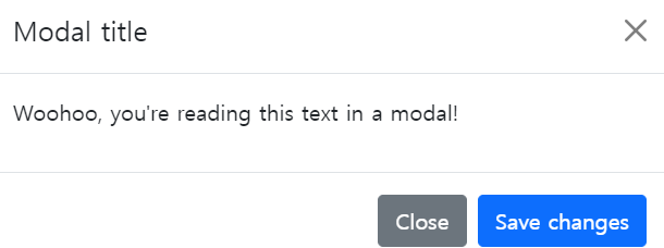
하지만 부트스트랩의 Modal 기능을 이용하면 더 나은 경고창을 띄울 수 있다.
-더 나은 경고창을 원하면
https://sweetalert2.github.io/
SweetAlert2
A beautiful, responsive, customizable and accessible (WAI-ARIA) replacement for JavaScript's popup boxes
sweetalert2.github.io
이 사이트에 들어가면 여러 경고창을 볼수있다.
부트스트랩 Components
accordion: 메뉴를 밑으로 내려가거나 올라가게 하는 것
badge: 뒤에 달리는 벳지
breadcrumb: 홈페이지 경로를 설명하는 것
button group: 버튼이 여러개 붙어있는 것
card: 박스 같이 생긴 것
<div class="container">
    <div class="row">
        <div class="col-md-4">
            <div class="card" style="width: 100%;">
                <img src="상어.jpeg" class="card-img-top" alt="...">
                <div class="card-body">
                    <h5 class="card-title">Card title</h5>
                    <p class="card-text">Some quick example text to build on the card title and make up the bulk of the card's content.</p>
                    <a href="#" class="btn btn-primary">Go somewhere</a>
                </div>
            </div>
        </div>
    </div>
</div>
card는 주로 쇼핑몰에서 이렇게 사용한다.
carousel: 옆으로 넘어가는 슬라이드
collapse: accordion이랑 비슷하지만 이건 버튼을 누르면 설명이 나온다.
navbar: 메뉴바
progress: 몇 퍼센트되었는지 막대로 표시
-부트스트랩 폰트 사이트
Font Awesome
The world’s most popular and easiest to use icon set just got an upgrade. More icons. More styles. More Options.
fontawesome.com
이 사이트에서 검색하면 원하는 폰트를 검색 가능
부트스트랩 템플릿을 사용할 때, 이미지를 직접 바꾸는 것보다 폴더에서 이미지를 찾아 같은 이름으로 덮어씌우는 것이 더 좋다.

-출처
https://www.youtube.com/watch?v=2znzBerWyWU
'HTML, CSS' 카테고리의 다른 글
| 드림코딩-반응형 헤더 정리(1, 큰 화면) (0) | 2022.05.13 |
|---|---|
| CSS-사진 크기 조절 (1) | 2022.05.09 |
| 부트스트랩 사용법(1) (1) | 2022.05.05 |
| CSS-반응형 웹 (0) | 2022.05.04 |
| CSS-가상 셀렉터, flexbox (1) | 2022.05.04 |


