| 일 | 월 | 화 | 수 | 목 | 금 | 토 |
|---|---|---|---|---|---|---|
| 1 | ||||||
| 2 | 3 | 4 | 5 | 6 | 7 | 8 |
| 9 | 10 | 11 | 12 | 13 | 14 | 15 |
| 16 | 17 | 18 | 19 | 20 | 21 | 22 |
| 23 | 24 | 25 | 26 | 27 | 28 | 29 |
| 30 |
Tags
- app router
- tailwind
- 무한 스크롤
- dfs
- useAppDispatch
- ESlint
- 인터섹션
- Jest
- 리터럴 타입
- Promise
- React
- async/await
- 태그된 유니온
- SSR
- 타입 좁히기
- CI/CD
- 호이스팅
- autosize
- 인증/인가
- 결정 알고리즘
- recoil
- TS
- 공변성
- webpack
- RTK Query
- 반공변성
- map
- MSA
- 투포인터
- CORS
Archives
- Today
- Total
짧은코딩
CSS-사진 크기 조절 본문
반응형
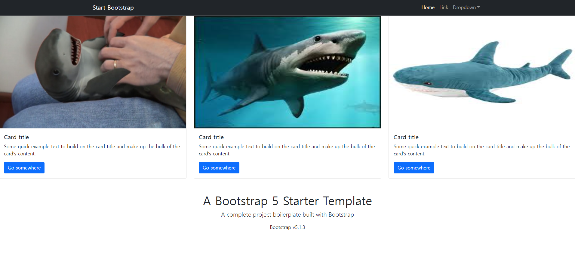
<div class="container1">
            <div class="row">
                <div class="col-md-4">
                    <div class="card" style="width: 100%;">
                        <img src="https://img.seoul.co.kr/img/upload/2015/07/17/SSI_20150717173042_V.jpg" class="card-img-top" alt="...">
                        <div class="card-body">
                            <h5 class="card-title">Card title</h5>
                            <p class="card-text">Some quick example text to build on the card title and make up the bulk of the card's content.</p>
                            <a href="#" class="btn btn-primary">Go somewhere</a>
                        </div>
                    </div>
                </div>
                <div class="col-md-4">
                    <div class="card" style="width: 100%;">
                        <img src="https://encrypted-tbn0.gstatic.com/images?q=tbn:ANd9GcTEfEkcmS4iktr-WhCOq_8QfD96mUB-01jnQA&usqp=CAU" class="card-img-top" alt="...">
                        <div class="card-body">
                            <h5 class="card-title">Card title</h5>
                            <p class="card-text">Some quick example text to build on the card title and make up the bulk of the card's content.</p>
                            <a href="#" class="btn btn-primary">Go somewhere</a>
                        </div>
                    </div>
                </div>
                <div class="col-md-4">
                    <div class="card" style="width: 100%;">
                        <img src="https://encrypted-tbn0.gstatic.com/images?q=tbn:ANd9GcR4IjJ78I527tazKwZwJQbVhnPhqfkB8SD8dA&usqp=CAU" class="card-img-top" alt="...">
                        <div class="card-body">
                            <h5 class="card-title">Card title</h5>
                            <p class="card-text">Some quick example text to build on the card title and make up the bulk of the card's content.</p>
                            <a href="#" class="btn btn-primary">Go somewhere</a>
                        </div>
                    </div>
                </div>
            </div>
        </div>
이 코드에서 사진의 크기를 통일 시키려고 했다.
-CSS
img {
    width : 50%;
    height: 40vh;
}
이렇게 하여 가로와 세로를 맞춰줬다.
반응형
'HTML, CSS' 카테고리의 다른 글
| 드림코딩-반응형 헤더 정리(2, 작은 화면) (0) | 2022.05.14 |
|---|---|
| 드림코딩-반응형 헤더 정리(1, 큰 화면) (0) | 2022.05.13 |
| 부트스트랩 사용법(2) (0) | 2022.05.06 |
| 부트스트랩 사용법(1) (1) | 2022.05.05 |
| CSS-반응형 웹 (0) | 2022.05.04 |
'HTML, CSS' Related Articles
more


Comments