
| 일 | 월 | 화 | 수 | 목 | 금 | 토 |
|---|---|---|---|---|---|---|
| 1 | ||||||
| 2 | 3 | 4 | 5 | 6 | 7 | 8 |
| 9 | 10 | 11 | 12 | 13 | 14 | 15 |
| 16 | 17 | 18 | 19 | 20 | 21 | 22 |
| 23 | 24 | 25 | 26 | 27 | 28 | 29 |
| 30 |
- 결정 알고리즘
- 호이스팅
- MSA
- async/await
- Promise
- CI/CD
- Jest
- app router
- 타입 좁히기
- TS
- 투포인터
- dfs
- 리터럴 타입
- tailwind
- useAppDispatch
- SSR
- ESlint
- autosize
- 반공변성
- 태그된 유니온
- 인터섹션
- CORS
- 인증/인가
- RTK Query
- React
- 공변성
- 무한 스크롤
- recoil
- webpack
- map
- Today
- Total
짧은코딩
GRID 본문
GRID의 기본 사용법
.father {
    display: grid;
}
flex처럼 display에 설정하면 된다.
.father {
    display: grid;
    grid-template-columns: 20px 55px 89px 100px;
}
이렇게 자식들이 순서대로 px의 크기 만큼 변했다.
.father {
  display: grid;
  grid-template-columns: 250px 250px 250px;
  gap: 10px;
  /*column-gap: 10px;*/
  /*row-gap: 10px;*/
}
gap를 활용해서 간격을 줄 수 있다. 주석문 처럼 따로따로 줄 수도 있다.
.father {
  display: grid;
  grid-template-columns: 250px 250px 250px;
  grid-auto-rows: 100px 40px;
  gap: 10px;
}
이렇게 줄마다 세로 크기를 다르게 줄 수도 있다.
template areas
.grid {
  display: grid;
  /*grid-template-columns: 200px 200px 200px 200px;*/
  grid-template-columns: repeat(4, 200px);
  /*grid-auto-rows: 300px 300px 300px 300px;*/
  grid-template-rows: repeat(3, 300px);
}

repeat을 이용하면 반복할 수 있다.
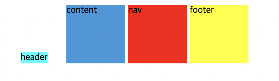
-layout
.grid {
  display: grid;
  grid-template-columns: repeat(4, 200px);
  grid-template-rows: 100px repeat(2, 200px) 100px;
  grid-template-areas:
    "header header header header"
    "content content content nav"
    "content content content nav"
    "footer footer footer footer";
}

.header {
  background-color: aqua;
  grid-area: header;
}

.content {
  background-color: black;
  grid-area: content;
}

.nav {
  background-color: red;
  grid-area: nav;
}

.footer {
  background-color: yellow;
  grid-area: footer;
}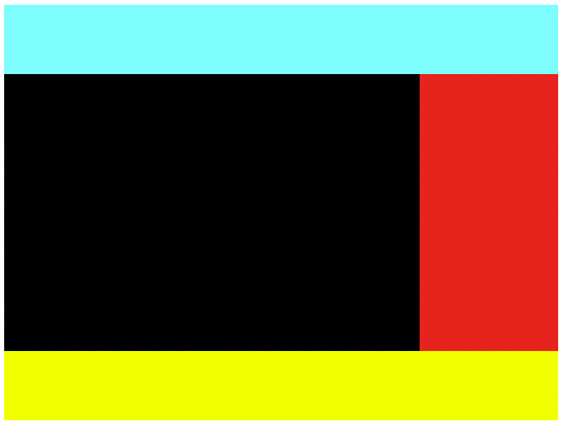
부모 태그에 grid-template-areas를 원하는 배치로 넣는다. 그리고 각 클래스에 grid-area에 사용 할 이름을 넣는다. 이 이름은 클래스 네임이랑 같을 필요가 없다.
grid-template-columns: auto 200%;만약 auto로 바꿔주면 화면 전체를 사용한다.
-grid-column-start/end
.grid {
  display: grid;
  gap: 10px;
  grid-template-columns: repeat(4, 100px);
  grid-template-rows: repeat(4, 100px) ;
}

.header {
  background-color: aqua;
  grid-column-start: 1;
  grid-column-end: 2;
}
이 상태에서 시작 지점은 맨 처음 라인이고 마지막 지점은 2번째 간격 줄이라는 의미이다. 따라서 위 사진처럼 나온다.
.grid {
  display: grid;
  gap: 10px;
  grid-template-columns: repeat(4, 100px);
  grid-template-rows: repeat(4, 100px) ;
}

.header {
  background-color: aqua;
  grid-column-start: 1;
  grid-column-end: 3;
}
마지막 지점이 3번째 라인이면 이렇게 된다.
.grid {
  display: grid;
  gap: 10px;
  grid-template-columns: repeat(4, 100px);
  grid-template-rows: repeat(4, 100px) ;
}

.header {
  background-color: aqua;
  grid-column-start: 1;
  grid-column-end: 5;
}

.content {
  background-color: black;
  grid-column-start: 1;
  grid-column-end: 4;
  grid-row-start: 1;
}
grid-row-start로 바꾸면 첫번째 요소와 두번째 요소의 자리가 바뀐다.
Shortcuts
-방법 1
.grid {
  display: grid;
  gap: 10px;
  grid-template-columns: repeat(4, 100px);
  grid-template-rows: repeat(4, 100px);
}

.header {
  background-color: aqua;
  grid-column: 1 / 5;
}

.content {
  background-color: black;
  grid-column: 1/ 4;
  grid-row: 2 / 4;
}

.nav {
  background-color: red;
  grid-row: 2 / 4;
}

.footer {
  background-color: yellow;
  grid-column: 1 / 5;
}
코드를 이렇게 짧게 줄일 수 있다.
-방법 2
.grid {
  display: grid;
  gap: 10px;
  grid-template-columns: repeat(4, 100px);
  grid-template-rows: repeat(4, 100px);
}

.header {
  background-color: aqua;
  grid-column: 1 / -1;
}

.content {
  background-color: black;
  grid-column: 1/ -2;
  grid-row: 2 / -2;
}

.nav {
  background-color: red;
  grid-row: 2 / 4;
}

.footer {
  background-color: yellow;
  grid-column: 1 / -2;
}
이 방법은 끝이 어딘지 알 필요 없다. 따라서 끝이 -1이고 끝에서 다음 지점은 -2 이런식으로 할 수 있다.
-방법 3
.grid {
  display: grid;
  gap: 10px;
  grid-template-columns: repeat(4, 100px);
  grid-template-rows: repeat(4, 100px);
}

.header {
  background-color: aqua;
  grid-column: span 4;
}

.content {
  background-color: black;
  grid-column: 1/ -2;
  grid-row: span 2;
}

.nav {
  background-color: red;
  grid-row: span 2;
}

.footer {
  background-color: yellow;
  grid-column: span 4;
}
4칸을 차지한다는 의미로 span 4를 써줘도 똑같은 결과가 나온다.
Line Naming
.grid {
  display: grid;
  gap: 10px;
  grid-template-columns: [first-line] 100px [second-line] 100px [third-line] 100px [fourth-line] 100px [fifth-line];
  grid-template-rows: repeat(4, 100px [sexy-line]);
}

.header {
  background-color: aqua;
  grid-column: span 4;
}

.content {
  background-color: #3498db;
  grid-column: first-line / fourth-line;
  grid-row: sexy-line 1 / sexy-line 3;
}

.nav {
  background-color: red;
  grid-row: span 2;
}

.footer {
  background-color: yellow;
  grid-column: span 4;
}
이렇게 라인에 이름을 주고 사용할 수도 있다. 결과는 위와 같다.
fraction
fraction은 사용 가능한 공간을 의미한다.
.grid {
  display: grid;
  gap: 10px;
  grid-template-columns: repeat(4, 1fr);
  grid-template-rows: repeat(4, 100px);
}
fr이라는 단위를 사용한다. 따라서 이렇게 표현하면 4개의 요소가 body의 전체를 4개로 분할해서 사용한다.
grid-template-columns: 4fr repeat(3, 1fr);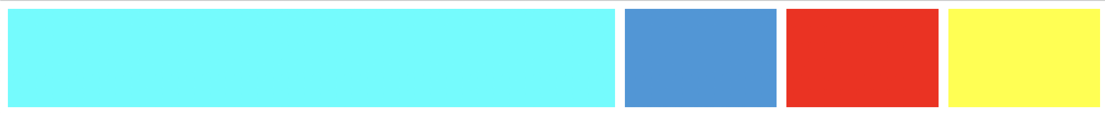
이렇게 비율을 다르게 할 수도 있다. 이것은 반응형 웹을 할 때 유용하다.
-지름길(grid-template)
.grid {
  display: grid;
  gap: 10px;
  height: 50vh;
  grid-template:
  "header header header header" 1fr
  "content content content nav" 2fr
  "footer footer footer footer" 1fr / 1fr 1fr 1fr 1fr
;
}

.header {
  background-color: aqua;
  grid-area: header;
}

.content {
  background-color: #3498db;
  grid-area: content;
}

.nav {
  background-color: red;
  grid-area: nav;
}

.footer {
  background-color: yellow;
  grid-area: footer;
}
이 코드에서 grid-template을 사용했다. 우선 각 줄의 뒤에 쓴 fr은 그 줄의 높이를 얼마로 줄건지를 적어놨다. 그리고 마지막 줄의 / 1fr 1fr 1fr 1fr은 각 줄의 폭(width)가 얼마나 될지를 적는다.
=> 이렇게 fr을 사용하면 화면 비율이 바껴도 요소들의 배열이 같다.
-naming 사용한 코드
.grid {
  display: grid;
  gap: 10px;
  height: 50vh;
  grid-template:
  [header-start] "header header header header" 1fr [header-end]
  [content-start]"content content content nav" 2fr [content-end]
  [footer-start] "footer footer footer footer" 1fr [footer-end] / 1fr 1fr 1fr 1fr
;
}

.header {
  background-color: aqua;
  grid-area: header;
}

.content {
  background-color: #3498db;
  grid-area: content;
}

.nav {
  background-color: red;
  grid-area: nav;
}

.footer {
  background-color: yellow;
  grid-area: footer;
}
이렇게 사용도 할 수 있다. 하지만 굳이 사용하지 않아도 된다.
justify-items/align-items
justify-items
.grid {
  display: grid;
  gap: 10px;
  height: 50vh;
  grid-template-columns: repeat(4, 1fr);
  grid-template-rows: repeat(4, 1fr);
  justify-items: stretch;
}
justify-items의 기본형은 stretch이다.
-start
justify-items: start;

이렇게 시작 부분을 기준으로 생긴다.
-center
justify-items: center;

중앙에 생긴다.
-end
justify-items: end;
이건 끝 부분에 생긴다.
align-items
.grid {
  display: grid;
  gap: 5px;
  height: 50vh;
  grid-template-columns: repeat(4, 1fr);
  grid-template-rows: repeat(4, 1fr);
  align-items: end;
}
align-items: end는 가로로 늘어진다.
-center
align-items: center;
위 사진에서 가운데로 올라간다.
-start
align-items: start;
맨 위에서 시작한다.
place-items
place-items의 처음은 수직이고 다음은 수평이다.
place-items: stretch center;
이렇게 사용이 가능하다.
justify-content, align-content, place-content
justify-content와 align-content 모두 flex 박스에서 사용하던 것을 생각하면 좋을 것 같다. 단, 이것들은 width, height가 충분히 커야 사용이 가능하다.
justify-content: 모든 grid를 수평적으로 움직이는 것이다.
align-content: 모든 grid를 수직적으로 움직이는 것이다.
pace-content: place-items 처럼 사용이 가능하다.
.grid {
  background-color: gray;
  display: grid;
  gap: 5px;
  height: 250vh;
  grid-template-columns: repeat(4, 100px);
  grid-template-rows: repeat(4, 100px);
  place-content: end center;
}
이렇게 나온다.
justify-self/align-self/place-self
.header {
  background-color: aqua;
  align-self: end;
}
한 개의 요소에만 속성을 적용할 수 있는 방법이다.
-place-self
.header {
  background-color: aqua;
  place-self: end center;
}
place-self로 위에서 한 코드를 한 줄로 적을 수 있다.
grid-auto-rows/columns & grid-auto-flow
grid-auto-rows/columns
.grid {
display: grid;
gap: 5px;
height: 50vh;
grid-template-columns: repeat(4, 100px);
grid-template-rows: repeat(4, 100px);
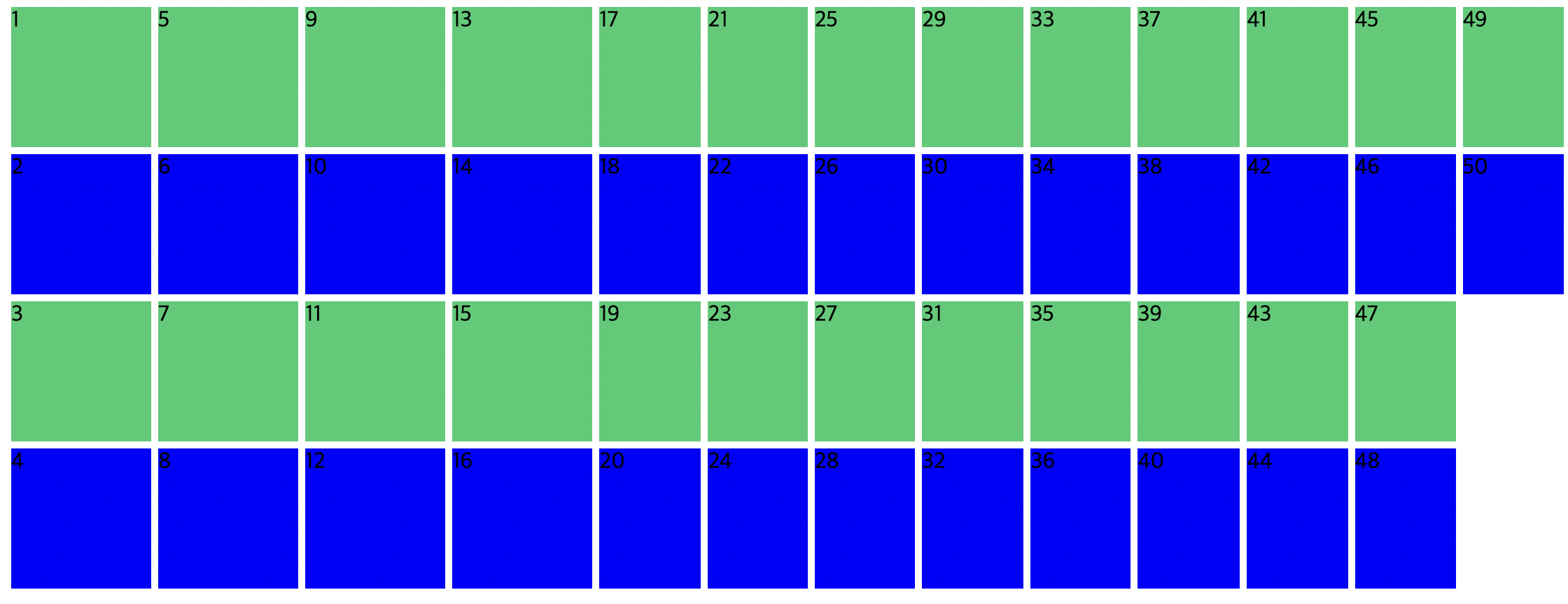
}박스가 50개인 상태에서 위 코드를 적용하면

이렇게 나타난다. 왜냐하면 4줄만 높이를 100px로 주라고 했기 때문이다. 따라서 grid-auto-rows/columns를 사용하면 여러 개의 요소가 와도 자동으로 길이를 줄 수 있다.
.grid {
  display: grid;
  gap: 5px;
  height: 50vh;
  grid-template-columns: repeat(4, 100px);
  grid-template-rows: repeat(4, 100px);
  grid-auto-rows: 100px;
}
이렇게 해결이 가능하다.
혹은
.grid {
  display: grid;
  gap: 5px;
  height: 50vh;
  grid-template-columns: repeat(4, 100px);
  grid-auto-rows: 100px;
}
이렇게 grid-auto-rows만 써줘도 된다.
grid-auto-flow
.grid {
  display: grid;
  gap: 5px;
  height: 50vh;
  grid-template-columns: repeat(4, 100px);
  grid-template-rows: repeat(4, 100px);
  grid-auto-flow: column;
}
grid-auto-flow는 flex-direction 같은 기능을 한다.
.grid {
  display: grid;
  gap: 5px;
  height: 50vh;
  grid-template-columns: repeat(4, 100px);
  grid-template-rows: repeat(4, 100px);
  grid-auto-flow: column;
  grid-auto-columns: 100px;
}
위 사진에 grid-auto-columns를 추가하면

이렇게 달력 같은 느낌으로도 만들 수 있다.
minmax
minmax는 요소가 너무 크지도 작지도 원하지 않을 때 사용한다.
.grid {
  display: grid;
  gap: 5px;
  height: 50vh;
  grid-template-columns: repeat(10, minmax(100px, 1fr));
  grid-template-rows: repeat(4, 100px);
  grid-auto-columns: 100px;
}
이렇게 하면 브라우저의 크기가 아무리 줄어도 최소 100px를 유지한다. 그리고 아무리 늘려도 최대 1fr을 유지한다.
auto-fit/fill
.grid1, .grid2 {
  display: grid;
  gap: 5px;
  grid-auto-rows: 100px;
  margin-bottom: 30px;
}

.item:nth-child(odd) {
  background-color: #2ecc71;
}

.item:nth-child(even) {
  background-color: blue;
}

.grid1 {
  grid-template-columns: repeat(auto-fill, minmax(100px, 1fr));
}

.grid2 {
  grid-template-columns: repeat(auto-fit, minmax(100px, 1fr));
}
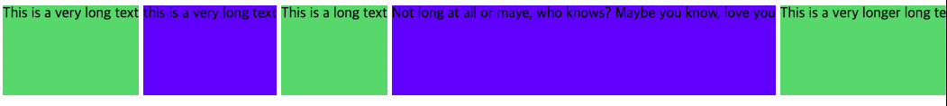
auto-fill: column을 우리가 준 사이즈 내에서 최대한 많이 만들어 준다. auto-fill이 해당 row를 column이 있는 만큼 가능한 많이 채운다. 따라서 빈 공간이 있다.
auto-fit: 요소들을 최대한 늘려서 row에 딱 맞춘다. 따라서 빈 공간이 없다.
max/min-content
.grid {
  display: grid;
  gap: 5px;
  grid-template-columns: max-content min-content;
  grid-auto-rows: 100px;
  margin-bottom: 30px;
}
max-content: content가 필요한 만큼 커졌다.
min-content: content가 얼마나 작게 될 수 있는지이다.
=> 즉 안에 뭐가 들었냐에 따라서 크기가 반응형으로 바뀐다.
-응용
.grid {
  display: grid;
  gap: 5px;
  grid-template-columns: repeat(5, minmax(max-content, 1fr));
  grid-auto-rows: 100px;
  margin-bottom: 30px;
}

이렇게 응용해서 사용이 가능하다. 이러면 최소가 max-content이고 최대가 1fr이다.
-응용2
.grid {
  display: grid;
  gap: 5px;
  grid-template-columns: repeat(auto-fit, minmax(100px, max-content));
  grid-auto-rows: 100px;
  margin-bottom: 30px;
}

이렇게도 된다.
'노마드 코더 > CSS Layout' 카테고리의 다른 글
| line-height, letter-spacing, 한 개의 클래스 제외하고 다 선택하는 법 (0) | 2022.08.17 |
|---|---|
| SCSS 설명 및 사용법 (1) | 2022.08.01 |
| Grid Garden (0) | 2022.07.29 |
| flex box property (0) | 2022.07.26 |


