| 일 | 월 | 화 | 수 | 목 | 금 | 토 |
|---|---|---|---|---|---|---|
| 1 | ||||||
| 2 | 3 | 4 | 5 | 6 | 7 | 8 |
| 9 | 10 | 11 | 12 | 13 | 14 | 15 |
| 16 | 17 | 18 | 19 | 20 | 21 | 22 |
| 23 | 24 | 25 | 26 | 27 | 28 | 29 |
| 30 |
- MSA
- webpack
- CI/CD
- tailwind
- SSR
- 타입 좁히기
- 호이스팅
- 공변성
- TS
- 태그된 유니온
- CORS
- map
- 결정 알고리즘
- async/await
- dfs
- 인터섹션
- 투포인터
- RTK Query
- autosize
- 인증/인가
- useAppDispatch
- recoil
- Jest
- ESlint
- 무한 스크롤
- Promise
- app router
- 리터럴 타입
- 반공변성
- React
- Today
- Total
짧은코딩
SCSS 설명 및 사용법 본문
SCSS
SCSS는 기본적으로 CSS preprocessor이다. Sass나 Scss는 같은 방식으로 사용한다. 사람들이 sass나 scss를 말할 땐 둘 다 거의 같다. scss는 css를 programming language처럼 만든다.
-gulpfile.bable.js
gulpfile.bable.js이 파일 안에서
const routes = {
  css: {
    watch: "src/scss/*",
    src: "src/scss/styles.scss",
    dest: "dest/css",
  },
};
src를 보면 styles.scss를 계속 관찰하고 있다. 그리고 이 파일에서 일어나는 일는 css로 컴파일된다.
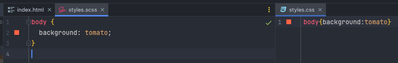
그러면 styles.scss에서 수정하면 styles.css가 바뀐다.
variables.scss

이렇게 _variables.scss를 만든다. _의 의미는 scss만을 위한 파일이란 의미다. css로 컴파일되지 않는다.
주로 원하는 색을 저장해둘 때 사용한다.
-_variables.scss
$bg: #e7473c;
-styles.scss
@import "_variables.scss";

body {
  background: $bg;
}
이렇게 활용이 가능하다.
Nesting
-html
<head>
    <meta charset="UTF-8" />
    <meta name="viewport" content="width=device-width, initial-scale=1.0" />
    <link rel="stylesheet" href="dist/css/styles.css" />
    <title>(S)CSS Masterclass</title>
  </head>
  <body>
  <h2>Title</h2>
  <div class="box">
      <h2>Another Title</h2>
      <button>Hello</button>
  </div>
  <button>Bye bye</button>
  </body>
</html>
-scss
@import "_variables.scss";

h2 {
  color: $bg;
}

.box {
  margin-top: 20px;
  &:hover {
    background-color: green;
  }
  h2 {
    color: blue;
  }
  button {
    color: red;
  }
}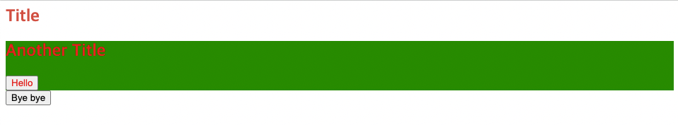
이런식으로 사용이 가능하다. 이렇게하면 class 이름을 적지 않아도 된다.
&는 부모 선택자이며 상위 태그를 선택할 수 있다.
mixins
_mixins.scss를 만들어준다. mixins는 사실상 함수의 기능이라 보면 된다. 즉 상황에 따라 다르게 코딩할 때 사용한다.
-_mixins.scss
@mixin  sexyTitle {
  color: blue;
  font-size: 30px;
  margin-bottom: 12px;
}
-html
<head>
    <meta charset="UTF-8" />
    <meta name="viewport" content="width=device-width, initial-scale=1.0" />
    <link rel="stylesheet" href="dist/css/styles.css" />
    <title>(S)CSS Masterclass</title>
  </head>
  <body>
    <h1>Hello</h1>
  </body>
</html>
-scss
@import "_variables.scss";
@import "_mixins.scss";

h1 {
  @include sexyTitle();
}
이렇게 @iunclude를 이용해서 사용할 수 있다.
하나만 사용하는 경우에는 유용하지 않겠지만 많은 아이템에서 사용하면 굉장히 유용하다.
if문을 사용하는 예시
-_mixins.scss
@mixin Link($word) {
  text-decoration: none;
  display: block;
  @if $word == "odd" {
    color: blue;
  } @else {
    color: red;
  }
}
-html
<head>
    <meta charset="UTF-8" />
    <meta name="viewport" content="width=device-width, initial-scale=1.0" />
    <link rel="stylesheet" href="dist/css/styles.css" />
    <title>(S)CSS Masterclass</title>
  </head>
  <body>
  <a href="#">Google</a>
  <a href="#">Google</a>
  <a href="#">Google</a>
  <a href="#">Google</a>
  <a href="#">Google</a>
  </body>
</html>
-scss
@import "_variables.scss";
@import "_mixins.scss";

a {
  margin-bottom: 10px;
  &:nth-child(odd) {
    @include Link("odd");
  }
  &:nth-child(even) {
    @include Link("even");
  }
}
이렇게 if문도 사용이 가능하다.
Extends
extends는 같은 코드를 중복하고 싶지 않을 때 사용한다. 다른 코드를 확장하거나 코드를 재사용하고 싶을때 사용한다.
extend에서 scss를 만드는 방법은 %를 사용하는 것이다.
-html
<head>
    <meta charset="UTF-8" />
    <meta name="viewport" content="width=device-width, initial-scale=1.0" />
    <link rel="stylesheet" href="dist/css/styles.css" />
    <title>(S)CSS Masterclass</title>
  </head>
  <body>
  <a href="#">Log In</a>
  <button>Log Out</button>
  </body>
</html>
-_buttons.scss
%button {
  font-family: inherit;
  border-radius: 7px;
  font-size: 12px;
  text-transform: uppercase;
  padding: 5px 10px;
  background-color: peru;
  color: white;
  font-weight: 500;
}
-styles.scss
@import "_buttons";

a {
  @extend %button;
  text-decoration: none;
}

button {
  @extend %button;
  border: none;
}
이 코드를 보듯이 @extend를 이용해 공통 속성을 줄 수 있다. 그리고 추가적으로 다른 속성도 각각 줄 수 있다.
Mixins and Conclusions
-html
<head>
    <meta charset="UTF-8" />
    <meta name="viewport" content="width=device-width, initial-scale=1.0" />
    <link rel="stylesheet" href="dist/css/styles.css" />
    <title>(S)CSS Masterclass</title>
  </head>
  <body>
    <h1>Hello</h1>
  </body>
</html>
-_mixins.scss
$minIphone: 500px;
$maxIphone: 690px;
$minTablet: $minIphone + 1;
$maxTablet: 1120px;

@mixin responsive($device) {
  @if $device == "iphone" {
    @media screen and (min-width: $minIphone) and (max-width: $maxIphone) {
      @content;
    }
  } @else if $device == "tablet" {
    @media screen and (min-width: $minTablet) and (max-width: $maxTablet) {
      @content;
    }
  } @else if $device == "iphone-l" {
    @media screen and (min-width: $minIphone) and (max-width: $maxIphone) and (orientation: landscape) {
      @content;
    }
  } @else if $device == "ipad-l" {
    @media screen and (min-width: $minTablet) and (max-width: $maxTablet) and (orientation: landscape) {
      @content;
    }
  }
}
-styles.scss
@import "_mixins.scss";

h1 {
  color: red;
  @include responsive("iphone") {
    color: yellow;
  }
  @include responsive("iphone-l") {
    font-size: 60px;
  }
  @include responsive("tablet") {
    color: green;
  }
}
이렇게 mixins를 이용해서 각 기기별로 반응형 사이트를 만들어 줄 수 있다.
'노마드 코더 > CSS Layout' 카테고리의 다른 글
| line-height, letter-spacing, 한 개의 클래스 제외하고 다 선택하는 법 (0) | 2022.08.17 |
|---|---|
| Grid Garden (0) | 2022.07.29 |
| GRID (0) | 2022.07.27 |
| flex box property (0) | 2022.07.26 |


