| 일 | 월 | 화 | 수 | 목 | 금 | 토 |
|---|---|---|---|---|---|---|
| 1 | 2 | 3 | 4 | 5 | 6 | |
| 7 | 8 | 9 | 10 | 11 | 12 | 13 |
| 14 | 15 | 16 | 17 | 18 | 19 | 20 |
| 21 | 22 | 23 | 24 | 25 | 26 | 27 |
| 28 | 29 | 30 | 31 |
- 태그된 유니온
- autosize
- React
- async/await
- 호이스팅
- useAppDispatch
- SSR
- TS
- ESlint
- 리터럴 타입
- 투포인터
- dfs
- app router
- RTK Query
- 결정 알고리즘
- CI/CD
- 인터섹션
- tailwind
- Promise
- 무한 스크롤
- webpack
- MSA
- map
- 타입 좁히기
- recoil
- CORS
- 반공변성
- Jest
- 인증/인가
- 공변성
- Today
- Total
짧은코딩
CSS-가상 셀렉터, flexbox 본문
가상 셀렉터
가상 셀렉터에는 가상 클래스와 가상 엘리먼트가 있고 선택된 요소에 특별한 상태나 특정 부분을 선택할 수 있는 셀렉터이다. :virtual selector와 같이 사용된다.
1. 가상 클래스
가상 클래스는 선택된 요소의 특정 상태에 동작하는 셀렉터이다. 링크에 마우스가 올라가거나 체크박스에서 선택되었을 때 스타일이 적용된다.
<style>
  /* 하이퍼 링크의 링크 텍스트 색상 지정 */
  a:link {
    color: red;
  }
  /* 하이퍼 링크에 마우스가 올라 갔을때의 색상 지정 */
  a:hover {
    color: hotpink;
  }
</style>

<body>
  <p><a href="default.asp">This is a link</a></p>
</body>
이 코드는 마우스를 이미지에 올렸을 때 스타일이 변경된다.
-많이 사용되는 가상 클래스
| :active | a:active | 링크를 마우스로 클릭 했을때 |
| :hover | a:hover | 마우스가 해당 요소의 위로 올라간 경우 |
| :link | a:link | 방문하지 않은 모든 링크를 선택 |
| :focus | input:focus | <input> 태그에서 해당 요소가 마우스 포커스를 가진경우(선택된 경우) |
| :checked | input:checked | <input> 태그에서 체크박스가 체크 되었을때 |
| :disabled | input:disabled | <input> 태그의 상태가 disabled 인 경우, disabled 속성 적용시 |
| :enabled | input:enabled | <input> 태그의 상태가 enabled 인 경우 |
| :first-child | p:first-child | 해당 요소의 첫번째 자식 요소를 선택 |
| :last-child | p:last-child | 해당 요소의 마지막 자식 요소를 손택 |
| :nth-child(n) | p:nth-child(2) | 해당 요소의 n번째 자식 요소를 선택 |
2. 가상 엘리먼트
가상 엘리먼트는 선택된 요소의 특정 위치에 동작하는 셀렉터로 특정 요소 앞, 뒤, 첫 글자, 첫 줄 등에 동작하는 스타일을 지정하기 위해 사용한다. ::pseudo element와 같이 사용한다.
<style>
  h1::before {
    content: "Title - ";
  }
</style>

<body>
  <h1>This is a heading</h1>
</body>
이 코드는 선택된 요소 앞에 다른 택스트를 삽입한다. 따라서 Title - This is a heading이렇게 된다.
-대표적 가상 엘리먼트
| ::after | p::after | 선택된 요소 다음 위치 |
| ::before | p::before | 선택된 요소 앞 위치 |
| ::first-letter | p::first-letter | 선택된 요소의 텍스트 내용중 첫번째 글자 |
| ::first-line | p::first-line | 선택된 요소의 텍스트 내용중 첫번째 줄 |
| ::selection | p::selection | 선택된 요소에서 텍스트가 선택(마우스로 클릭해서 영역 지정)된 영역 |
Flexbox

- flex container: 정렬하려는 요소의 부모 요소
- flex item: flex container 의 아이템들로 정렬하려는 대상
- main axis: 메인 축으로 왼쪽에서 오른쪽으로 움직이는 inline 방향(역방향도 가능)
- cross axis: 메인과 교차하는 축으로 위에서 아래로 움직이는 block 방향(역방향도 가능)
<!DOCTYPE html>
<html lang="en">
<head>
<meta charset="UTF-8">
<title>Title</title>
<link rel="stylesheet" href="test.css">
</head>
<body>
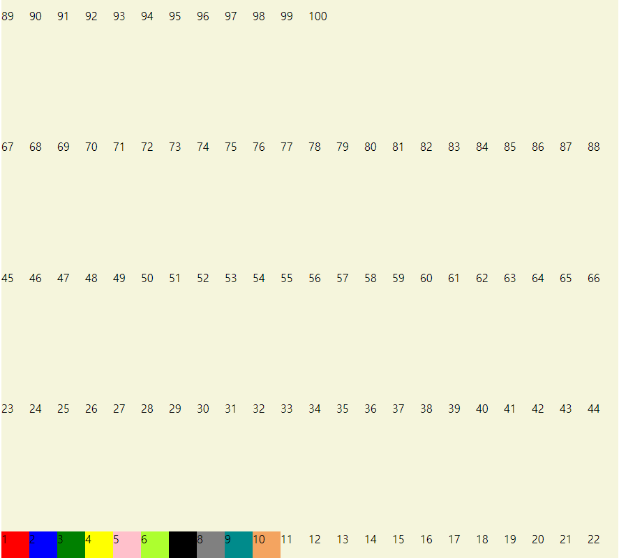
<div class="container">
<!--div.container>div.item.item${$}*10하면 아래코드 생김-->
<!--div 태그의 클래스는 컨테이너라고 지정, 컨테이너 안에 div에 클래스는 item이라하고 ${$}*10하면 10개 만들어줌 이러고 Tab 키를 눌러야함 -->
<div class="item item1">1</div>
<div class="item item2">2</div>
<div class="item item3">3</div>
<div class="item item4">4</div>
<div class="item item5">5</div>
<div class="item item6">6</div>
<div class="item item7">7</div>
<div class="item item8">8</div>
<div class="item item9">9</div>
<div class="item item10">10</div>
</div>
</body>
</html>div.container>div.item.item${$}*10하면 아래코드 생김
div 태그의 클래스는 컨테이너라고 지정, 컨테이너 안에 div에 클래스는 item이라하고 ${$}*10하면 10개 만들어줌 이러고 Tab 키를 눌러야한다.
.container{
    background: beige;
    height: 100vh;
/*100%로 하면 %는 부모의 높이에 100% 채우겠다는 의미다. 그래서 container의 부모인 body 길이만큼 채운다.   */
/*100vh로 하면 뷰포트 값의 100%를 사용하겠다는 의미이다.     */
}

.item1{
    background: red;
}
.item2{
    background: blue;
}
.item3{
    background: green;
}
.item4{
    background: yellow;
}
.item5{
    background: pink;
}
.item6{
    background: greenyellow;
}
.item7{
    background: black;
}
.item8{
    background: gray;
}
.item9{
    background: darkcyan;
}
.item10{
    background: sandybrown;
}
100%로 하면 %는 부모의 높이에 100% 채우겠다는 의미다. 그래서 container의 부모인 body 길이만큼 채운다.
100vh로 하면 뷰포트 값의 100%를 사용하겠다는 의미이다.
-CSS 색 보는 사이트
https://material.io/resources/color/#!/?view.left=0&view.right=0&primary.color=303F9F
Color Tool - Material Design
Create and share color palettes for your UI, and measure the accessibility of any color combination.
material.io
-display:flex;
.container{
    background: beige;
    height: 100vh;
/*100%로 하면 %는 부모의 높이에 100% 채우겠다는 의미다. 그래서 container의 부모인 body 길이만큼 채운다.   */
/*100vh로 하면 뷰포트 값의 100%를 사용하겠다는 의미이다.     */
    display: flex;
}
위에서 아래로 바뀌게된다.

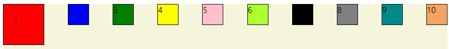
-flex-direction
- row: 기본값은 row고 row는 가로로 왼쪽에서 오른쪽으로 보낸는 것

- row-reverse;는 가로로 10부터 반대로 나온다.

- column으로 하면 1부터 10까지 세로로 나온다.

- column-reverse로 하면 10부터 세로로 나온다.

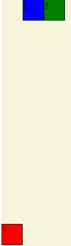
-flex-wrap
- nowrap: 기본값은 nowrap 박스들이 여러개 붙어있으면 래핑을 안해서 한줄에 따닥따닥 붙어있는 경우다.
- wrap: wrap면 한줄이 꽉차면 다음줄로 자동적으로 넘어간다.

- wrap-reverse: 마찬가지로 거꾸로 나온다.
-flex-flow
flex-flow는 flex-direction, flex-wrap를 합쳐서 사용하는 것이다.
flex-direction은 수평이 중심축인지 수직이 중심축인지 결정
flex-wrap은 한줄이 가득차면 다음 줄로 넘어가게 할건지 안할건지 결정
-justify-content
중심축에서 아이템들을 어떻게 배치할 것인지
flex-start: 기본값이며 처음부터 왼쪽으로 나열한다. 수직축이 중심축이면 위에서 아래로
flex-end: 아이템의 순서는 유지하는데 오른쪽으로 붙인다.
center: 가운데에 위치한다.
space-around: 박스를 둘러싸게 스페이스를 넣어준다. 가운데 있는 애들은 왼쪽에 있는 스페이스 조금도 포함해서 좀 더 크다.

space-evenly: 똑같은 간격을 넣어준다.
space-between: 왼쪽과 오른쪽은 화면에 맞게 배치하고 중간에만 스페이스를 넣어준다.
-align-items
반대축에서 아이템들을 어떻게 배치할 것인지
center: center; 반대축(수평, 수직 중)에서 가운데에 패치한다.
이 사진과 같은 상황에서 align-items: baseline;을 하면

이렇게 기준을 맞춰준다.
-align-content
justify-content와 비슷하지만 반대축에서 아이템을 배정한다.

space-between: 위와 아래 붙어 있어있고 중간의 아이템에 스페이스가 들어간다.
center: 중간으로 아이템들이 모여서 배치
-Item 속성값들
- order
.container{
    background: beige;
    height: 100vh;
    display: flex;
}

.item{
    width: 40px;
    height: 40px;
    border: 1px solid black;
}

.item1{
    background: red;
    order: 2;
}
.item2{
    background: blue;
    order: 3;
}
.item3{
    background: green;
    order: 1;
}
order를 사용하면 첫번째걸 두번째로 보내고, 두번째걸 세번째로 보내는 것이 가능하다.
- flex-grow
.item1{
    background: red;
    flex-grow: 1;
}
기본값은 0이고 컨테이너를 꽉 채울려고 늘어난다.
모든 아이템을 1로 하면 모두 늘어나서 채울려고 한다.
- flex-shrink
점점 작아졌을 때, 어떻게 행동하는지 지정
다른 아이템들은 1인데 2인 아이템이 있으면 2인 아이템은 줄어들 때, 더 작게 줄어든다.
- flex-basis
공간을 얼마나 차지해야하는지 도와주는 것이다.
기본값은 auto이고 flex-grow, flex-shrink에 맞게 변형된다.
하지만 60% 이렇게 비율로 두면 커질때나 줄어들때 비율에 맞게 커지고 줄어든다.
- align-self
아이템 별로 아이템을 정렬할 수 있다.
.item1{
    background: red;
    align-self: center;
}
이 사진 처럼 아이템 하나만 가운데 정렬이 가능하다.
-이해를 돕기위한 게임 사이트
Flexbox Froggy
A game for learning CSS flexbox
flexboxfroggy.com
답
1
flex-direction: row-reverse;
2
justify-content:center;
3
justify-content: space-around;
4
justify-content: space-between;
5
align-items: flex-end;
6
justify-content: center;
align-items: center;
7
justify-content: space-around;
align-items: flex-end;
8
flex-direction: row-reverse;
9
flex-direction: column;
10
flex-direction: row-reverse;
justify-content: left;
11
flex-direction: column;
justify-content: flex-end;
12
flex-direction: column-reverse;
justify-content: space-between;
13
flex-direction: row-reverse;
justify-content: center;
align-items: flex-end;
14
order: 3;
15
order:-1;
16
align-self: flex-end;
17
order: 5;
align-self: flex-end;
18
flex-wrap: wrap;
19
flex-direction: column;
flex-wrap: wrap;
20
flex-flow: column wrap
21
align-content: flex-start;
22
align-content: flex-end;
23
flex-direction: column-reverse;
align-content: center;
24
flex-flow:column-reverse wrap-reverse;
justify-content: center;
align-content: space-between;
'HTML, CSS' 카테고리의 다른 글
| 부트스트랩 사용법(1) (1) | 2022.05.05 |
|---|---|
| CSS-반응형 웹 (0) | 2022.05.04 |
| CSS-Positon, float/display, 박스 요소 정렬 (1) | 2022.05.03 |
| CSS-캐스케이딩, 박스 모델, 레이아웃 (0) | 2022.05.03 |
| CSS) 미디어 쿼리 (0) | 2022.03.31 |


